
The Comprehensive Guide to Color Harmony, Polar Wheels, and Real-World Design Systems
Are you looking for an accurate color wheel online to construct professional brand palettes without relying on guesswork? Have you ever chosen a set of colors that looked clean in a design app, only to discover they were unreadable on buttons and failed basic contrast tests? Don't worry, my friend! You are in the right place. Today, we are going to walk through our advanced color wheel generator, examine how a complementary color wheel operates, and demonstrate how to build accessible design systems in a very simple and structured way.
Why Isolated Color Selection Fails Modern User Interfaces
From my personal perspective, picking standalone swatches from an inspiration board is one of the most common pitfalls in digital design. A single color never exists alone; it interacts dynamically with typography, dark surfaces, and surrounding borders.
When you rely on a mathematical color wheel generator, your choices are anchored in proven optical laws. Whether you search for a colour wheel complementary colours tool or need an interactive complementary color picker, having live feedback across real SaaS dashboards, data cards, and navigation bars is what distinguishes an amateur setup from enterprise engineering.
- Continuous Geometric Alignment: The polar coordinate ring guarantees that every harmonic relationship maintains an exact geometric interval across the 360-degree spectrum.
- Simultaneous Perceptual Contrast: You can observe how your primary shade interacts against dark slate surfaces and clean white containers simultaneously.
- Predictable System Scales: The engine automatically maps your base hue into a 50 to 950 tonal ladder, providing the precise steps needed for borders, subtle fills, and hover interactions.
- Production Token Sync: Direct one-click exports for Shadcn UI, Tailwind CSS v4, custom CSS variables, and raw JSON tokens for design engineering handoffs.
The Geometry of Complementary Colors (180° Optical Tension)
What makes a complementary color wheel so powerful in product design? At its core, complementary harmonies pair two hues located directly opposite each other on the circle, separated by a precise 180-degree interval.
This physical separation produces maximum visual contrast and retinal stimulation. Placing a deep cobalt blue alongside a warm amber coral causes both colors to stand out vividly. In software applications, utilizing a complementary colors generator allows you to allocate your base hue for brand identity while reserving the exact opposite accent strictly for high-conversion actions, such as primary checkout buttons or critical status indicators.
Orbital Controls: Mastering Luminance and Saturation Without Clutter
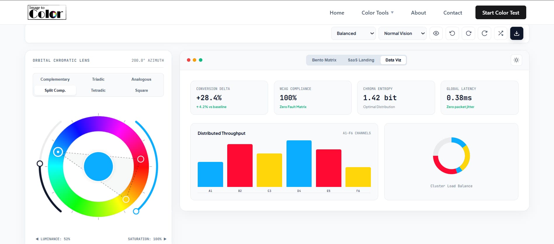
Notice the dual concentric arcs wrapped around the canvas above. Instead of forcing you to drag separate, disconnected sliders at the bottom of the page, our Orbital Chromatic Lens integrates every parameter directly into the canvas:
Luminance Modulation
Controls the lightness value from 15% to 85%. Sliding this arc lets you calibrate your colors to meet strict background readability standards without changing your base hue angle.
Saturation Control
Adjusts color intensity from 20% to 100%. Allows you to shift from subdued corporate tones to vivid cyber aesthetics with smooth, real-time feedback.
On mobile screens, the complementary colour wheel retains a strict 1:1 circular ratio. You can rotate the handles with your thumb while watching the live SaaS dashboard update underneath without any screen jumping or broken layouts.
Accessibility Engineering: Moving Beyond Basic WCAG 2.1 to APCA
Ensuring accessibility is no longer optional; modern regulations such as the European Accessibility Act of 2025 require digital products to remain legible for everyone. While legacy WCAG 2.1 checks rely on a rigid mathematical ratio, our color wheel complementary system incorporates the modern APCA (Advanced Perceptual Contrast Algorithm) metrics.
APCA calculates contrast based on spatial frequency, font weight, and whether text is dark-on-light or light-on-dark. An Lc score above 75 ensures that regular body text remains effortlessly readable for aging eyes and in high-glare environments. If your score drops, clicking our Auto-Fix button instantly nudges your lightness values until full AAA compliance is achieved.
Designing for Color Vision Deficiencies (CVD)
More than 300 million people experience some form of color vision deficiency. When using our color wheel complementary colors workspace, you can switch the simulation filter at the top to preview how your palette appears under:
- Protanopia: Reduced sensitivity to red wavelengths, causing reds and greens to appear as muted browns and yellows.
- Deuteranopia: The most common form of green-blindness, requiring distinct luminance separation rather than hue alone for critical UI alerts.
- Tritanopia: Rare blue-yellow confusion, where blues shift greenish and yellows appear pinkish or light grey.
- Achromatopsia: Complete absence of color perception, proving that visual hierarchy must function entirely through tonal contrast and structure.
Color Harmony Comparison Matrix
| Harmony Mode | Angular Offset | Visual Energy | Ideal Application |
|---|---|---|---|
| Complementary | 0° and 180° | High visual tension | Conversion buttons, hero cards, landing pages |
| Triadic | 0°, 120°, 240° | Balanced richness | Multi-series data charts, feature comparisons |
| Analogous | -35°, 0°, +35° | Cohesive and calm | Editorial platforms, backgrounds, reader apps |
| Split-Complementary | 0°, 150°, 210° | Softened contrast | Enterprise tools, fintech software, portals |
| Tetradic / Square | 0°, 90°, 180°, 270° | Complex spectrum | Complex dashboards, gaming UI, creative suites |
Step-by-Step Workflow: From Blank Canvas to Production Code
Here is the exact procedure I follow to construct scalable design palettes in less than two minutes:
- Select Your Archetype: Pick Balanced, Luxury, Cyberpunk, or Wild from the top dropdown to set smart saturation boundaries automatically.
- Sweep the Primary Azimuth: Grab the master node on the 360-degree lens and rotate it to your foundational brand color.
- Calibrate the Orbital Arcs: Adjust the left arc for luminance and the right arc for saturation until your APCA readout displays "Preferred".
- Lock the Core Node: Click the cybernetic lock icon on your primary swatch card to prevent accidental modification during iteration.
- Generate Variations: Press the Spacebar or click the Generate button to let the engine calculate harmonic companion nodes around your locked anchor.
- Export the Manifest: Open the Export modal, choose Shadcn / Tailwind v4 or raw CSS variables, and paste the code directly into your global stylesheet.
Frequently Asked Questions (FAQ)
Conclusion:
Creating beautiful, functional interfaces should never depend on chaotic trial and error. By pairing a reliable color wheel with an interactive complementary colors generator and live design system previews, you can build accessible, high-converting digital products with total confidence.
I hope this comprehensive guide and studio elevate your daily workflow. Feel free to explore the controls above, lock your favorite nodes, and export your tokens directly into your next build!
— Ahmed Adan